The ask was to create NEW keyart for the title Stranger of Paradise: Final Fantasy Origin using the established guidelines.
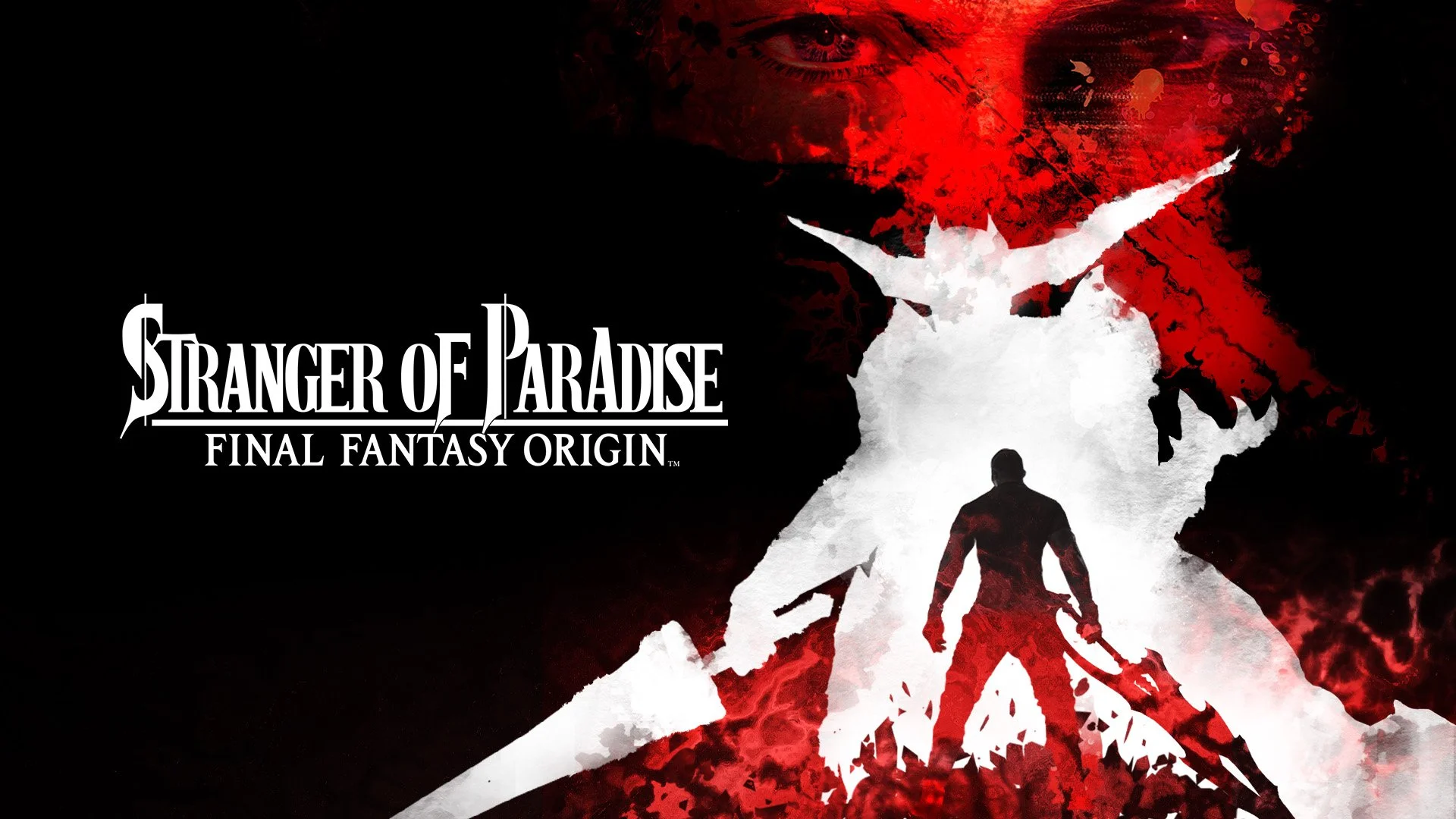
THE CHALLENGE: The initial concept had no emotional or visual connection for new fans or returning fans. The visual language of the campaign (black, white, and red, with ink wash textures and paint splatter) suggests chaos and duality. While tonally strong, the composition lacks a focal anchor and felt incomplete as a standalone marketing asset.
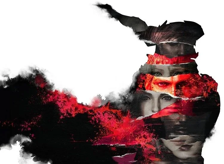
THE SOLVE: Tell a story in the image to draw the viewer in and create a dramatic visual.
Warning spoilers ahead.
The revised key art recontextualizes these elements into a fully realized, dark cinematic composition. The ink wash and splatter technique remains but is scaled dramatically, the eyes of the protagonist engage with the viewer as the slash bleeds across the upper canvas in deep crimson. The villain silhouette stands at center, rendered in high-contrast white against the silhouette of the “hero”, creating a clear visual hierarchy and immediate read at any size. The fragmented layering of the original concept is evolved into a cohesive double-exposure treatment (the hero within the monster) that subtly hints at the game's twist ending that you are the villain.
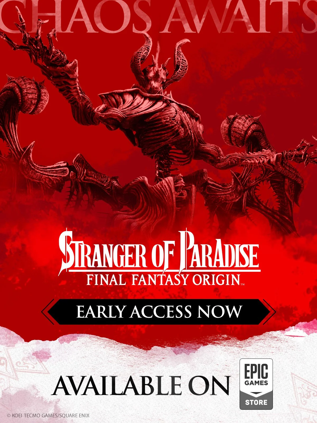
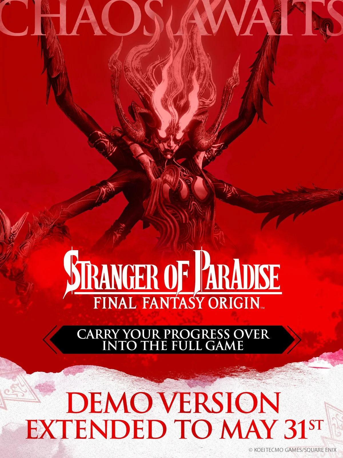
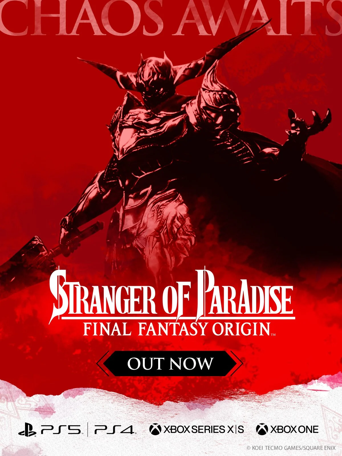
PRE-ORDER CAMPAIGN: Although the developers did not use the key art, it served as inspiration for the creation of our digital campaign. Since the character artwork received negative feedback, I was tasked with coming up with a unique pre-order campaign. Staying true to the style guide requirements we instead pivoted to using the monsters of the game since they were visually compelling and shifted the focus to who you would battle against.